Building a shared system for how Mix products were designed and built
I was the design-system DRI: I made the strategic case, aligned design and front-end needs, and led the structure connecting Figma, tokens, accessible components, and product implementation.
A growing platform was accumulating inconsistency and implementation debt
Mix.dialog, Mix.nlu, Dashboard, and the surrounding platform were growing through separate product teams. Shared interaction problems were being solved repeatedly, design files and front-end code drifted apart, and accessibility quality depended too heavily on each implementation.
The dark interface used by conversation designers had also drawn critical feedback for being difficult to read and parse. A theme alone could not fix the underlying problem: the platform needed shared structure, behavior, and ownership.
The opportunity was larger than a component library. We needed a common operating model for design and engineering.
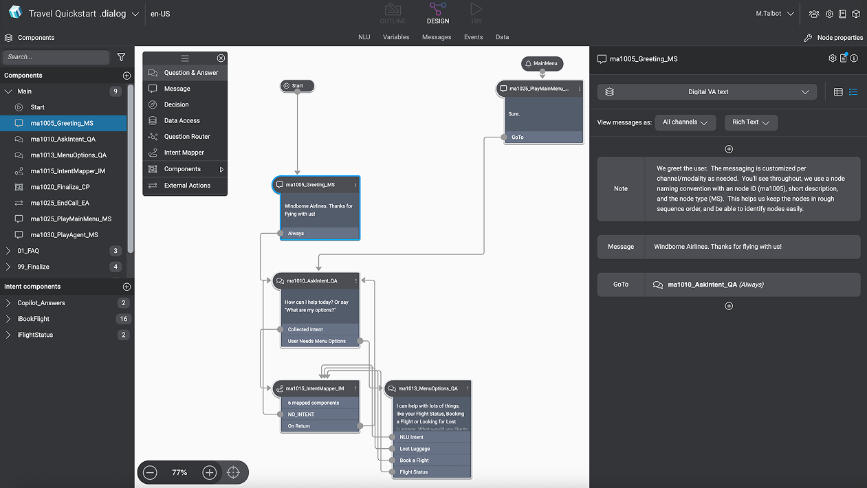
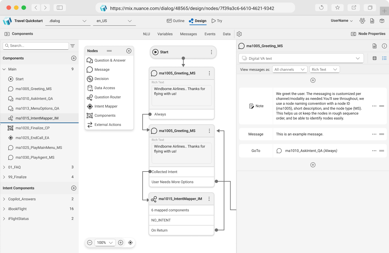
Turn 2–3 years of design-engineering groundwork into a platform strategy
I was not a people manager, but I was the DRI for the system. My role was closer to a product and technical lead: define how the system needed to work, align it with business and front-end constraints, and create a plan multiple teams could execute.
Connect design inconsistency to product delivery
I spent years building support for a design system by connecting repeated UX problems to engineering pain, accessibility risk, and the cost of product teams solving the same foundations separately.
Lead the move from Sketch and Abstract to Figma
I worked directly with Finance to bring Figma to Nuance CoreAI and Healthcare, then trained three design teams to use it effectively. Shared components and collaborative design became an organizational capability rather than a file-format change.
Make Figma and front-end composition describe the same system
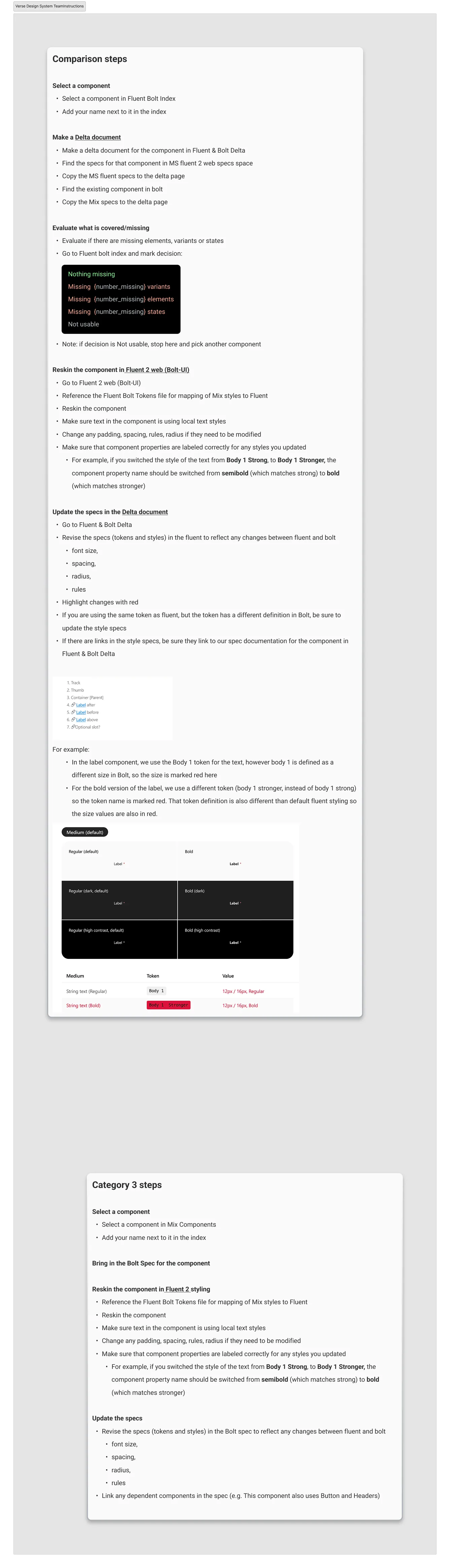
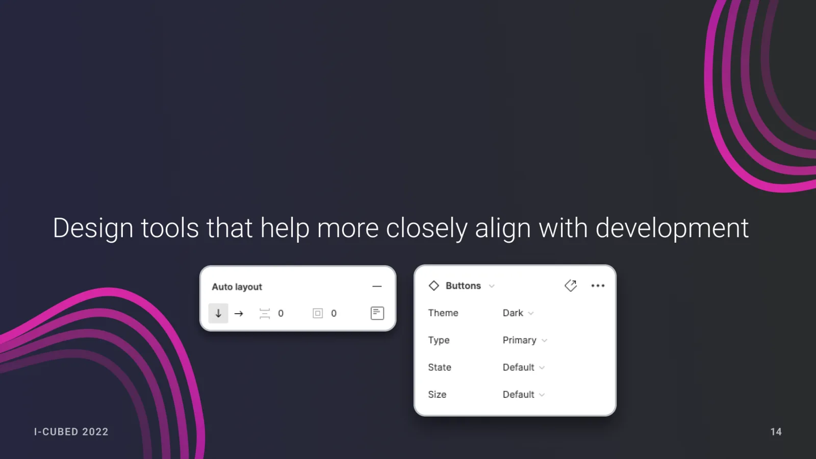
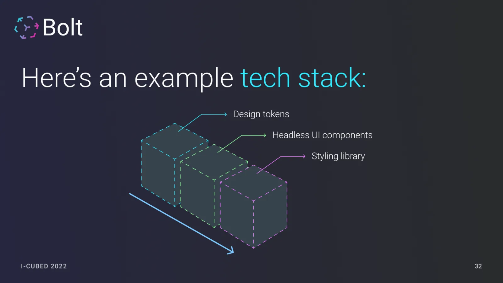
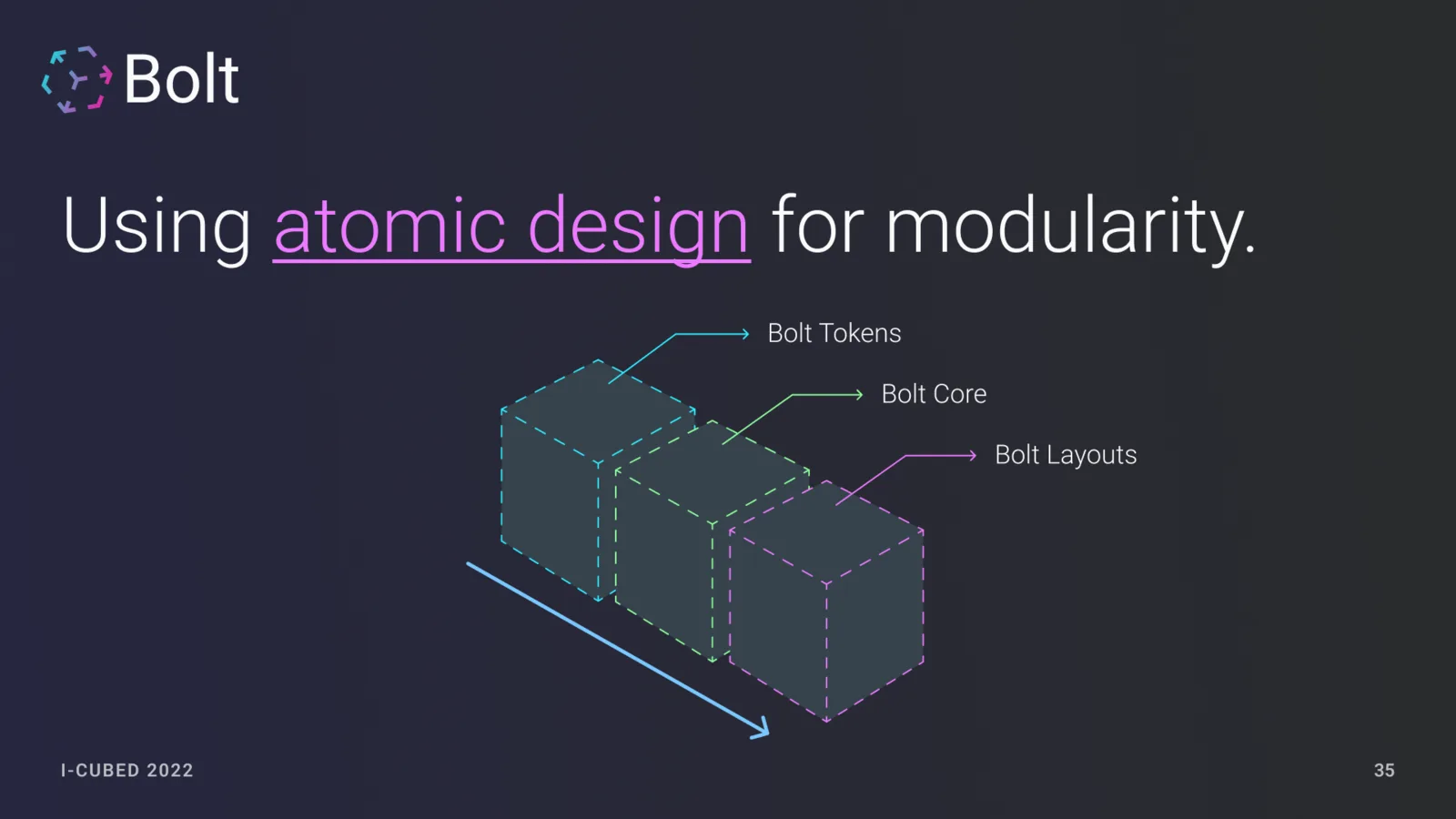
I defined how tokens, components, layouts, states, and extension points should compose so designers and engineers could reason about the same building blocks in their own tools.
Give leadership a credible path across products and teams
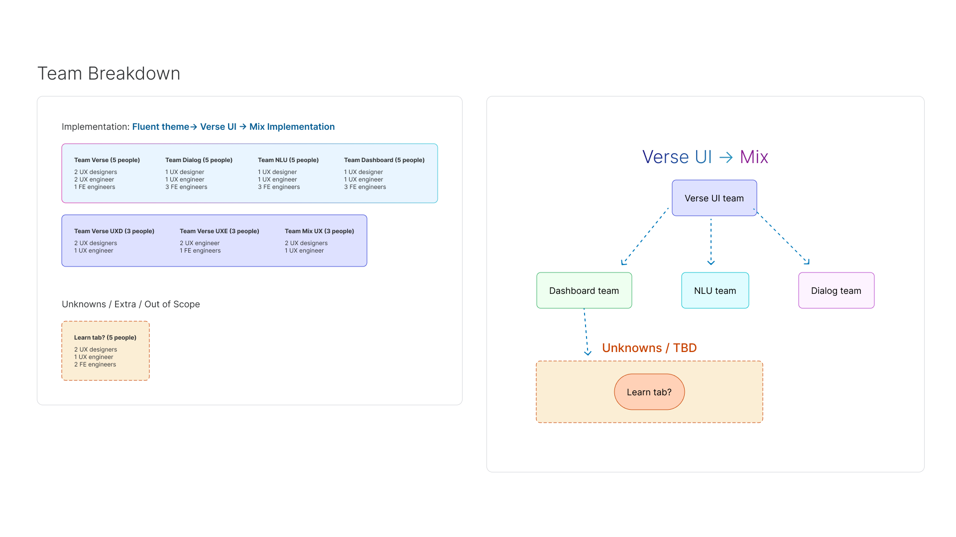
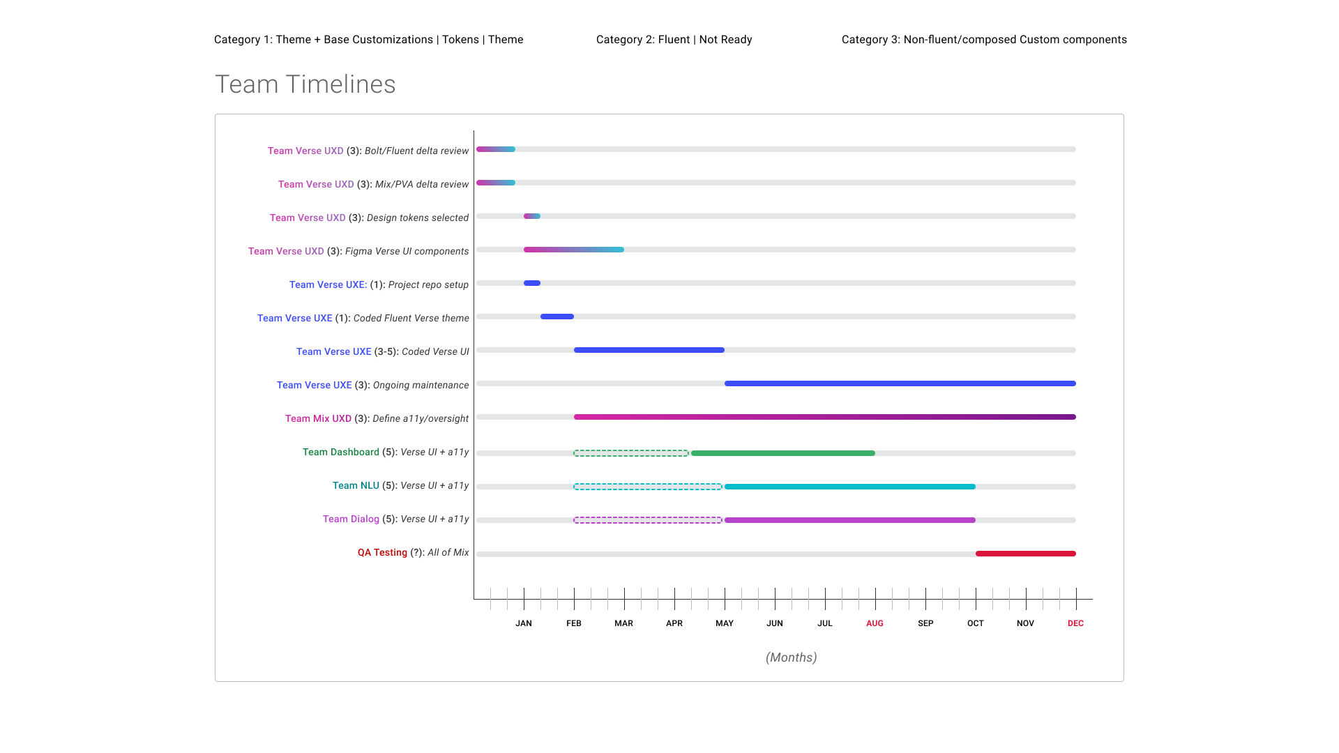
I created the architecture, team model, component categories, and phased timeline used to align leadership and coordinate Verse with Dialog, NLU, Dashboard, and Mix design work.
Teach the shared language before asking teams to adopt it
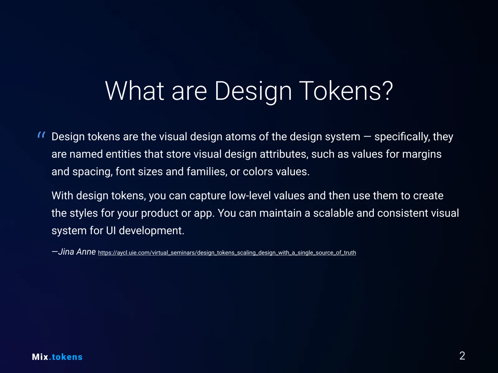
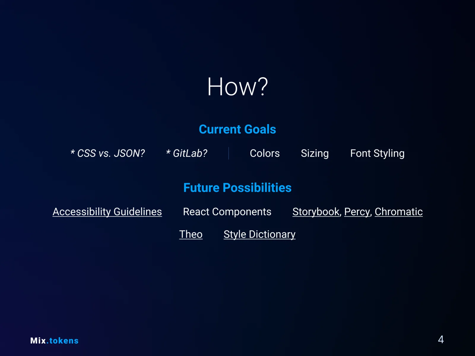
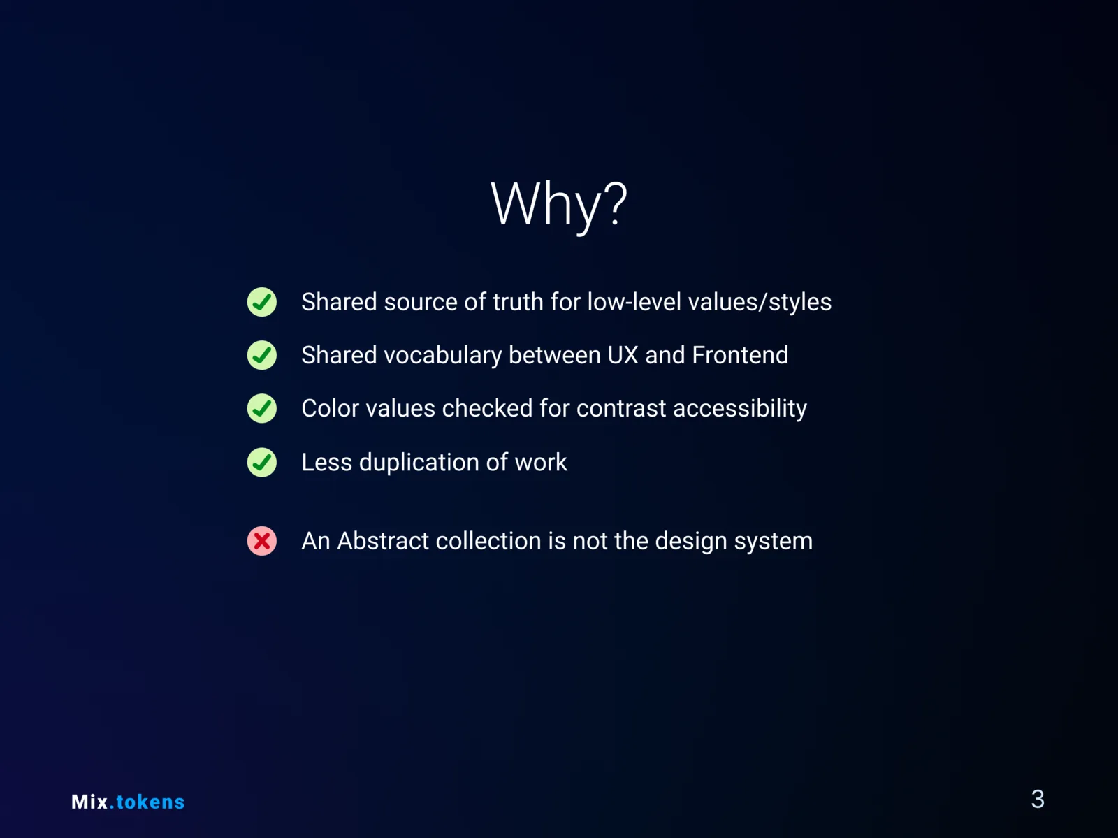
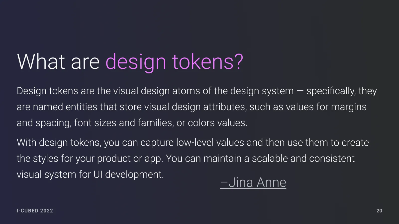
Before Bolt—the early name for Verse—was built, I made a compact Mix.tokens presentation to explain why low-level design decisions should become named, reusable values shared by design and front-end. The teaching work made the later architecture easier to discuss.

Build on proven foundations, then customize only where Mix required it
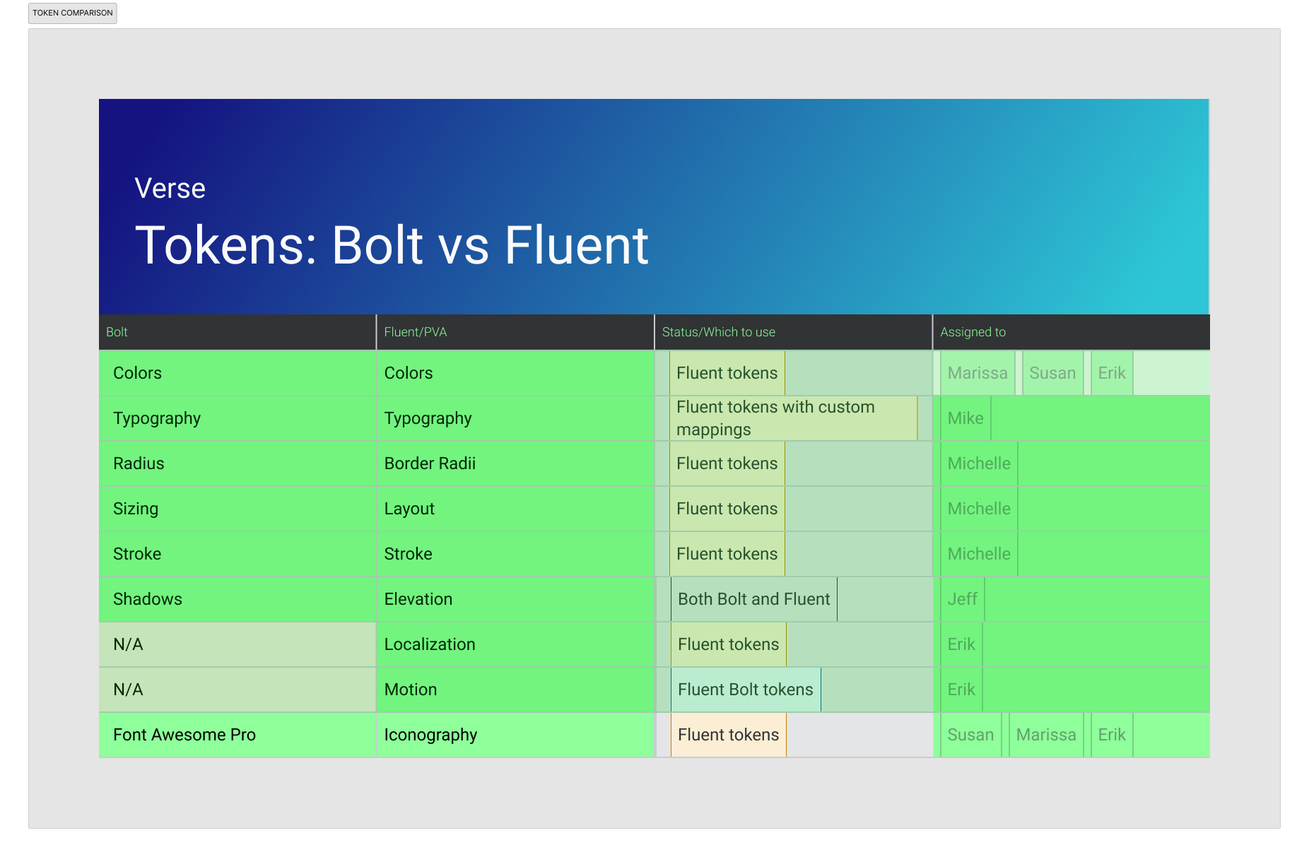
After the Microsoft acquisition, the system moved toward Fluent 2. The architecture deliberately separated what could be adopted directly from what needed a thin Verse wrapper and what only made sense for Mix products.
- Category 1 · Adopt
- Fluent 2 or Radix UI used as-is, with shared themes and tokens supplying the platform expression.
- Category 2 · Extend
- Components with targeted changes that still wrapped and preserved the Fluent 2 or Radix counterpart.
- Category 3 · Compose
- Mix-specific components created for product workflows that the underlying libraries did not address.
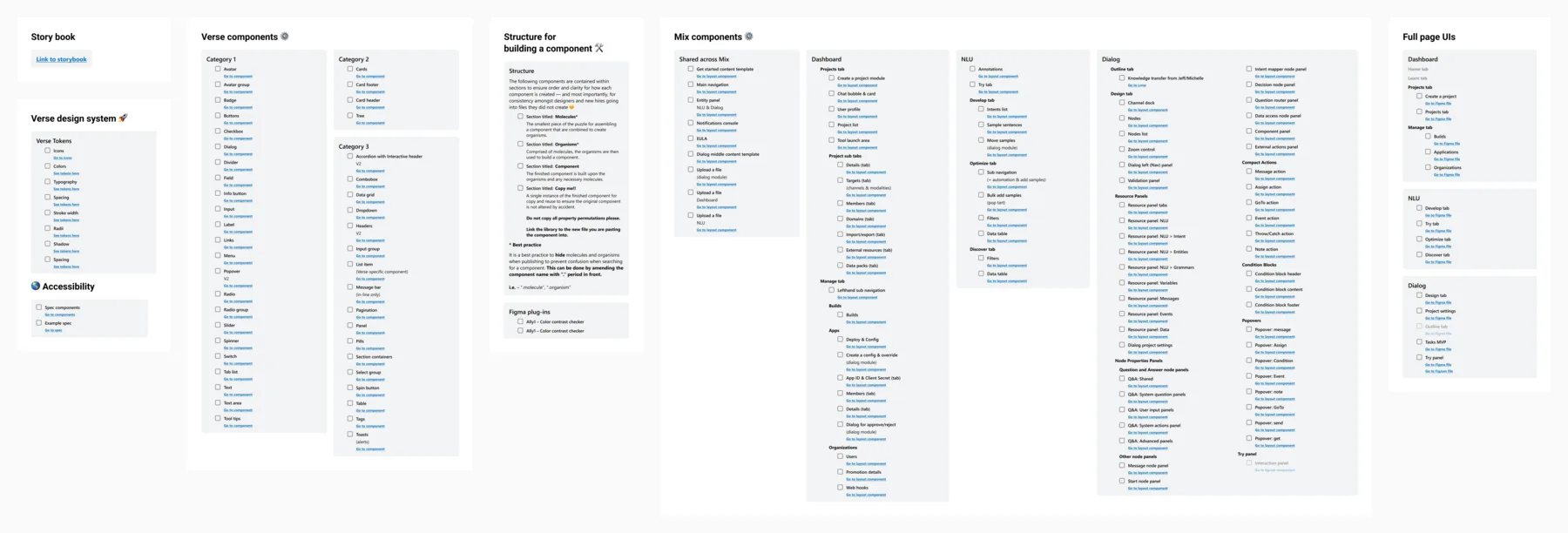
The components were designed as composable systems, not isolated screens
Card parts, states, tokens, and layout behavior could be assembled into product-specific components without breaking the shared foundation. This was the structure I led; the Verse development team built the component kit in partnership with me and another Senior UI Engineer.
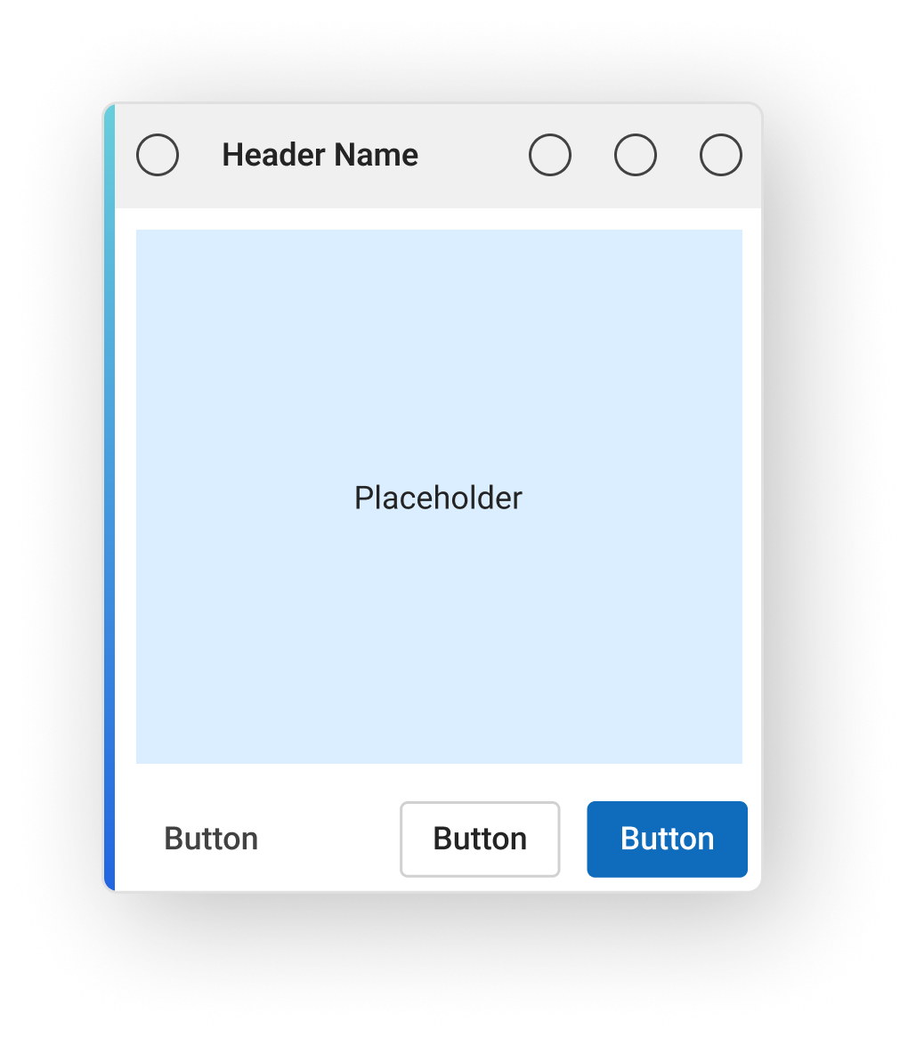
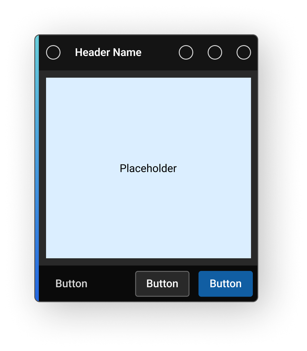
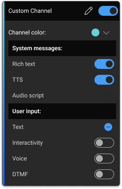
Coordinate a system that crossed disciplines, products, and delivery teams
The plan separated the Verse platform work from product implementation while keeping both connected. UX designers defined and validated the shared experience, UX engineers bridged Figma and code, the Verse engineering team built the library, and product teams integrated it into their own surfaces.
Track the work at component level
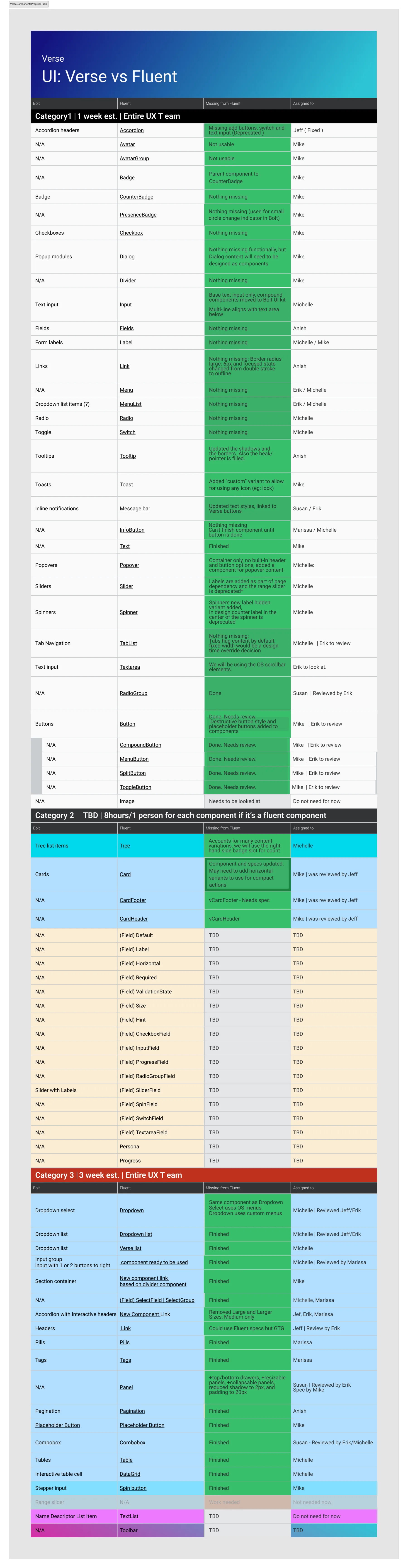
Progress tables made category, design status, accessibility review, engineering ownership, and product adoption visible. That detail was essential for managing a program without relying on title-based authority.
Make accessibility part of component architecture and governance
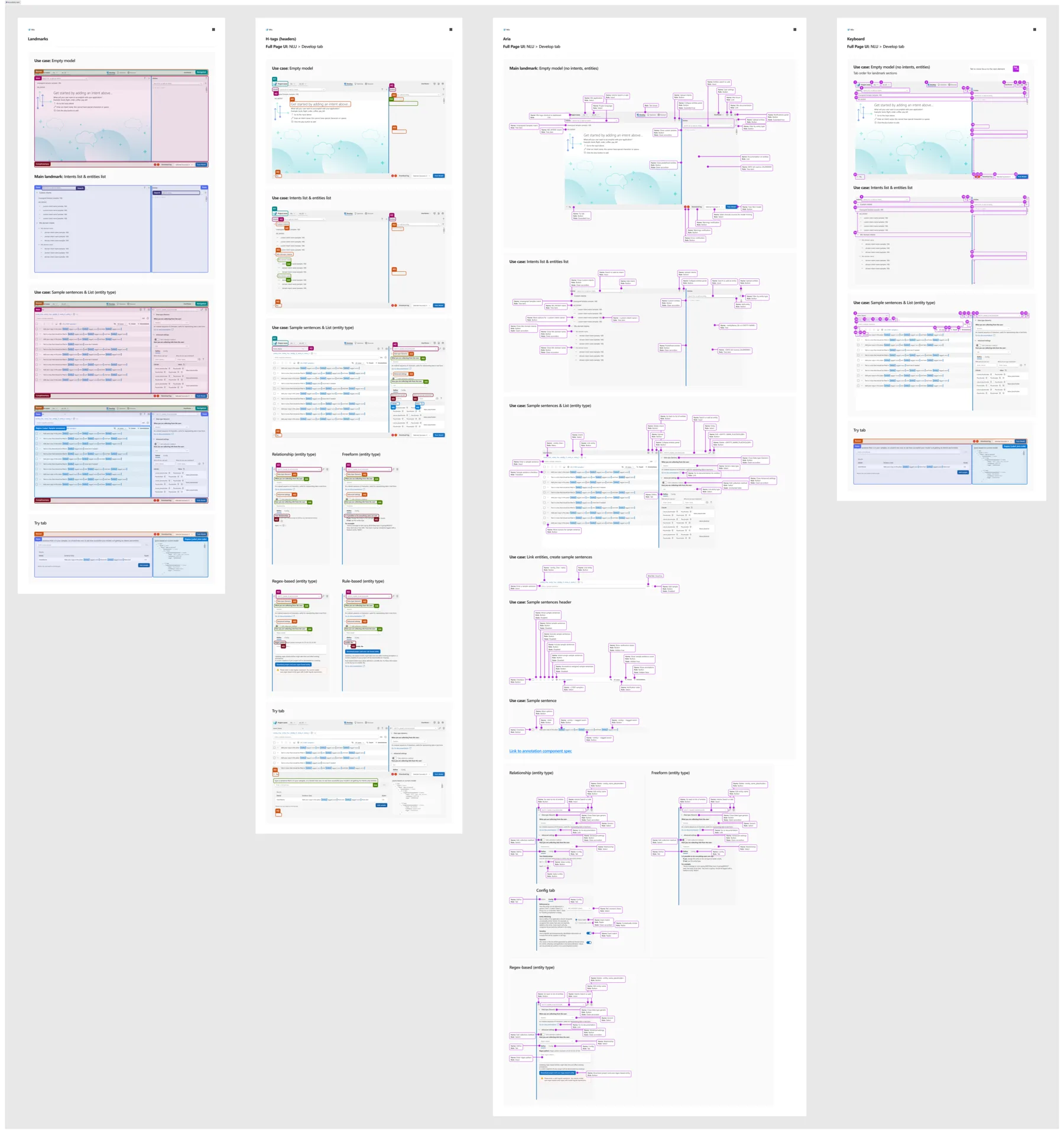
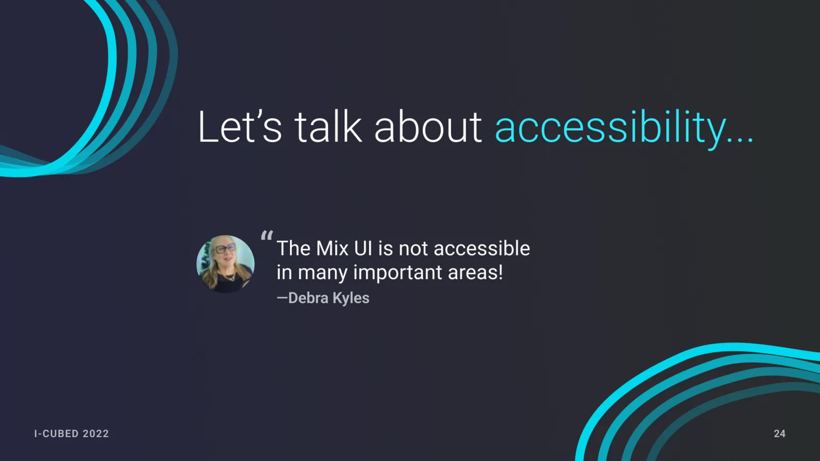
Accessibility was a shared responsibility across Verse and Mix.Verse. As the Verse DRI, I was accountable for making accessibility part of the system architecture. I collaborated with Mix team members on requirements, examples, and how those principles carried into product implementation.
The artifact below shows the scope of the accessibility work around Verse and Mix.Verse. It was authored by a Mix team member.
Show the organization why the system mattered
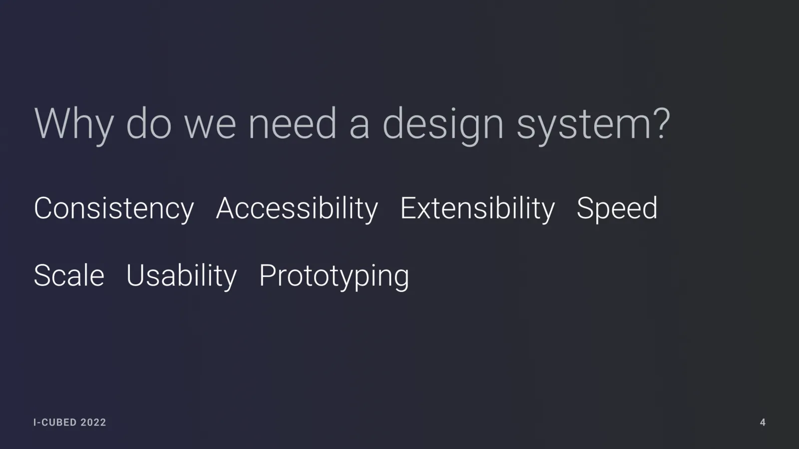
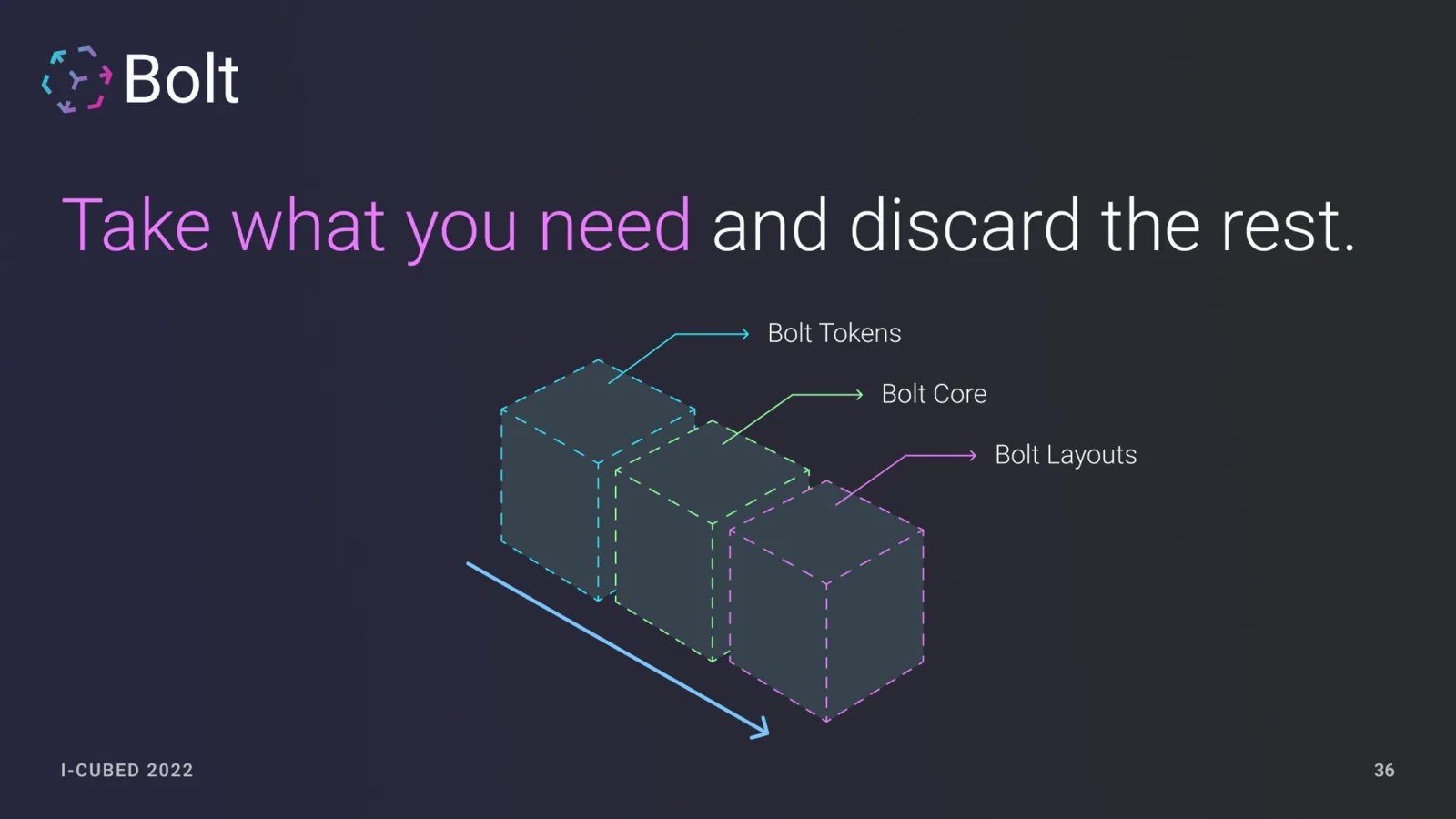
I presented the strategy at Nuance i3 in 2022 under the earlier Bolt name. The talk connected the move to Figma, design tokens, accessible headless components, composition, and the principle that product teams should take the layers they needed rather than fork the entire system.
A shared foundation that product teams could turn into Mix.Verse
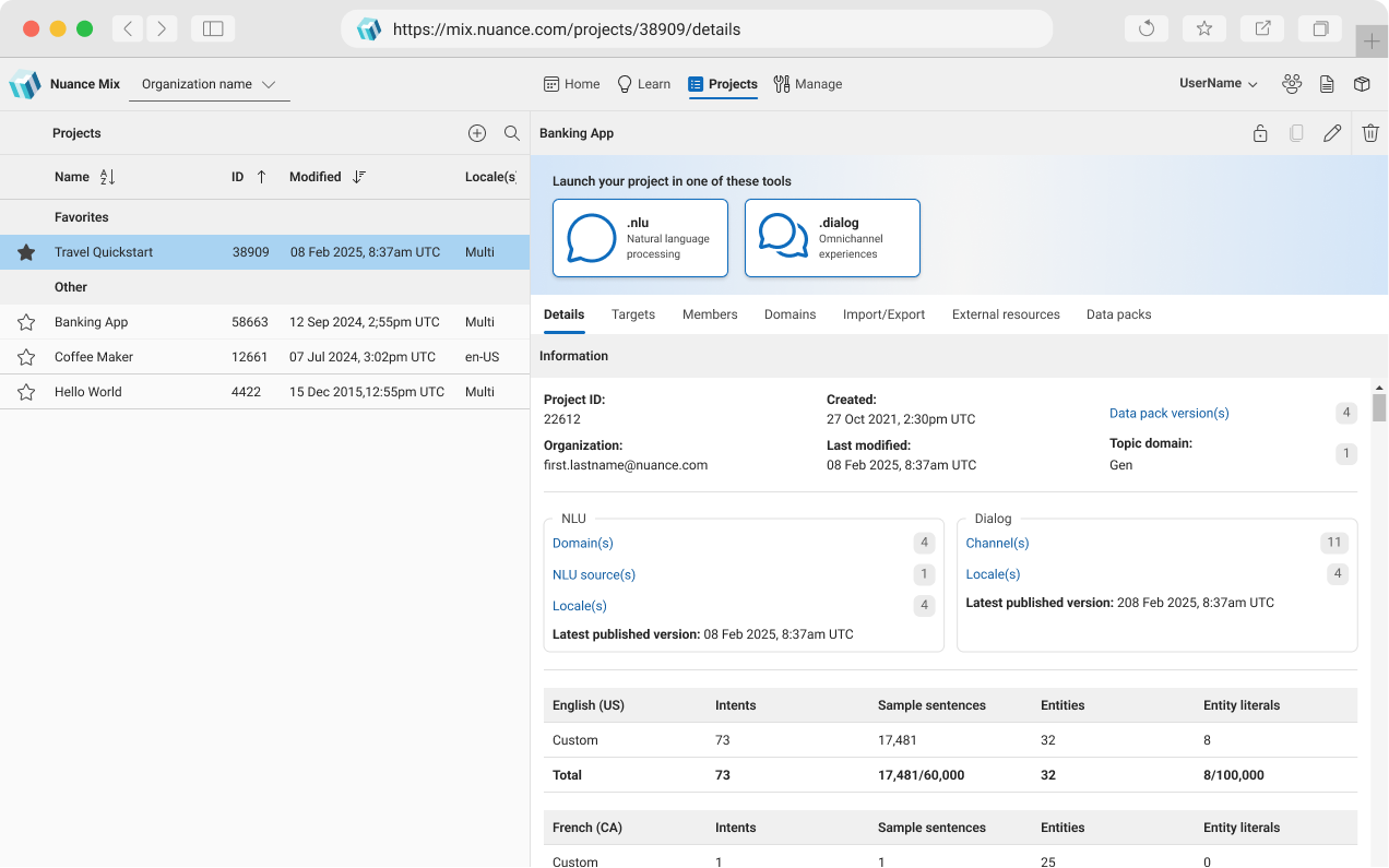
The Verse development teams built the production component kit with my guidance and in partnership with another Senior UI Engineer. The Mix product team then used that foundation to create Mix.Verse for the individual products.
A public component library
The live Storybook documents themes, tokens, icons, core components, accessibility utilities, and Mix-specific components.
One language across tools
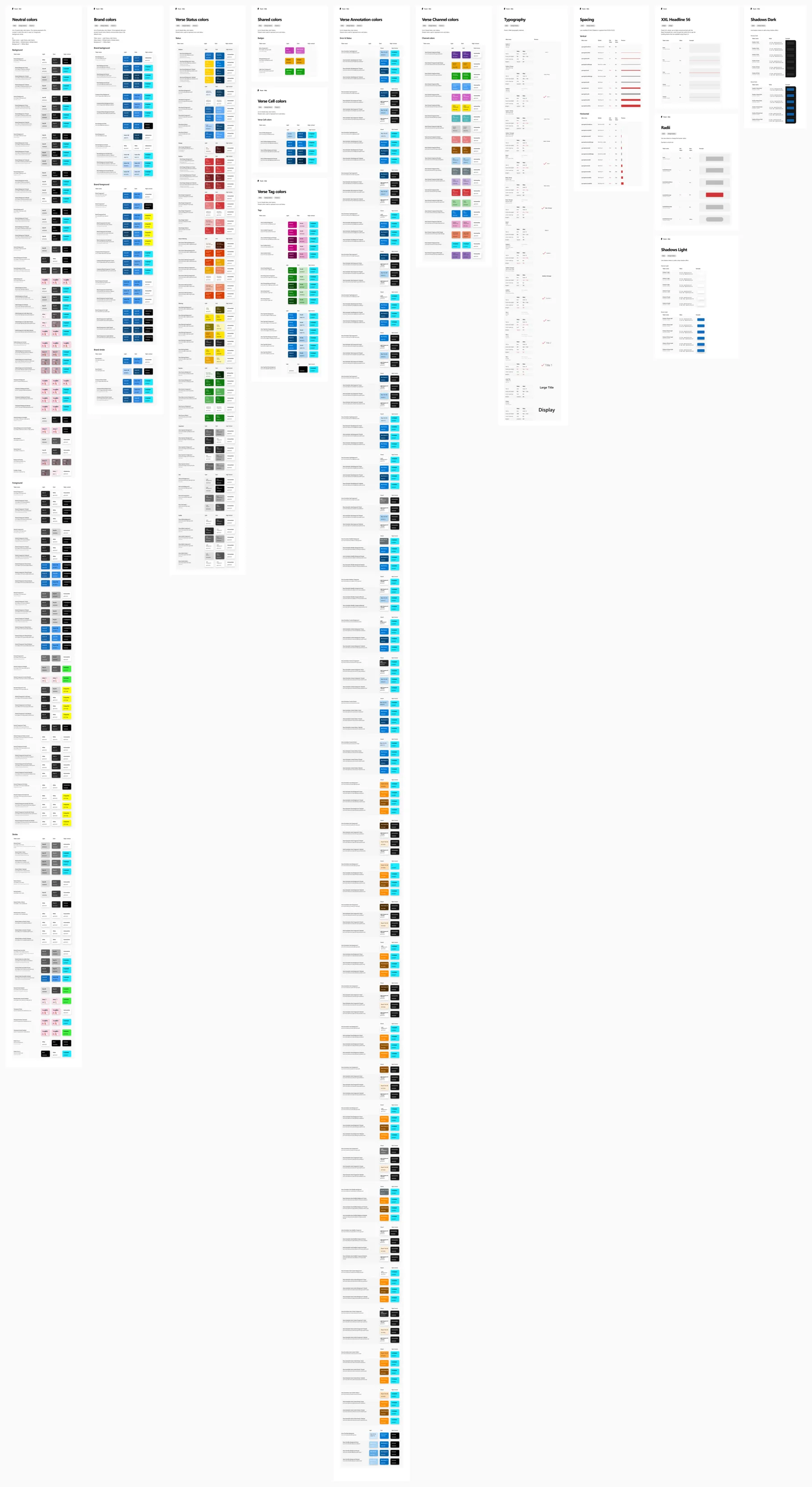
Tokens, component composition, states, and naming connected Figma decisions to front-end implementation.
A foundation for product expression
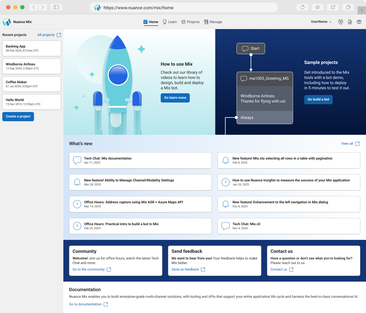
Dialog, NLU, Dashboard, and Mix.home could share system behavior while adapting it to their distinct workflows.
“He led the new design system effort, both in Figma architecture and in developer coordination. As the official liaison to our developers, he is the essential glue between our designs and the final result.”
“Your dual expertise in design and coding fosters a much-needed synergy between our design and development teams. It leads to more efficient workflows and a deeper mutual understanding.”
“His cross-domain expertise allows him to not only deliver exceptional UI designs but also to consider implementation details. This thoughtful approach significantly facilitates communication between the design and engineering teams.”
Colleague feedback from internal reviews, quoted by role rather than by name.
Explore the live Verse UI Storybook The surviving live implementation of Verse documents its themes, components, accessibility utilities, and Mix-specific layer. View live Storybook 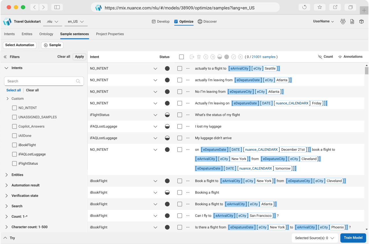
What I led, and what the broader team built
My responsibility. I was the Verse design-system DRI and led the strategy, design and front-end architecture, component composition model, Figma adoption, cross-team plan, and implementation guidance.
Shared implementation. The component library was built by the Verse development teams with my guidance and in partnership with another Senior UI Engineer. The Mix product team carried the foundation into Mix.Verse.
Accessibility credit. I was accountable for accessibility as part of the Verse system. A Mix team member authored the later specification shown here; we collaborated on the broader accessibility approach.
Naming. Bolt was the earlier name used in the 2022 i3 presentation. Verse is the public name of the system that followed.